Emblem-atic
Nothing symbolizes Star Trek like the insignia worn by its Starfleet characters as seen on TV from 1966–present day. Midyear 2020 brought it to the forefront when the official U.S. Space Force emblem was unveiled to historically naïve cries that it “rips off” the Star Trek emblem.
Over the years, many assumptions have been made about the various Starfleet insignia worn on the original Star Trek and through Lower Decks and the upcoming Strange New Worlds. Join us as we take a deep dive into the show’s most distinctive emblems, their origins, inspirations and the intentions behind them.
Trademarking the Future
There’s no way to know how early Gene Roddenberry decided he wanted a device or symbols to associate with Star Trek and the U.S.S. Yorktown Enterprise. His desire for such a thing first appears in the historical record some four months before photography would begin on the first pilot. On August 10th, 1964 Roddenberry sent a memo to art director Pato Guzman on the subject of a “distinctive emblem,” something immediately identifiable and also with merchandising potential.[1]
This thinking ultimately resulted in three distinct emblems for the first Star Trek pilot: what we’ll call the United Earth (and its related Caduceus in the second), the Boomerang, and the Flying A, all of which have descendants in various sequels and spin-offs. We’ll also touch on the Outpost insignia, the Starfleet Sunflower, and the rule breakers that are Commodore Decker and the crew of the U.S.S. Exeter.
NOTE: We will not be covering Starfleet seen in alternate timelines and alternate realities, etc., except those in the so-called Kelvin timeline. Non-Starfleet insigia and emblems are likewise a topic for another time.
Let’s begin with the more obscure, barely seen emblems and work our way to the big ones.
The United Earth
First up is what we’re calling the United Earth emblem, which features a laurel wreath surrounding a drawing of the planet Earth, below which is the text U.S.S. ENTERPRISE. It’s a western-centric emblem depicting the Americas. So far as we know, it only appears in the two pilot episodes (by all means, please let us know if it’s shown elsewhere).
In Star Trek’s first pilot, “The Cage” (actually titled “The Menagerie”, and later referred to as “The Cage” to differentiate it from the two-part “The Menagerie” episode), it is best glimpsed in the scene in Captain Pike’s quarters, most notably on Dr. Boyce’s light blue lab coat, and also on the tan coats of the Transporter Chief and his Transporter Tech (as identified in the call sheets), where it appears to have been screen printed with hand-applied gold detail on the laurels.
It can be glimpsed on the cover of Pike’s metal clipboard, too. And, finally, and nearly impossible to see, one is on a small round patch on Pike’s unworn hat seen sitting on his TV console (minus the text).
Additionally, it’s possible to catch glimpses of the emblem on the covers of the metal clipboards seen on the bridge.


![Detail of printing[2]](https://images.squarespace-cdn.com/content/v1/5d8938941257b15f27f817c2/1632971779307-0J0LH3PEASXZII00KC01/USS.+Enterprise+globe+logo+Pilot+1+%28Boyce%29+DETAIL+Karl+Tate+WM.jpg)


Incidentally, in a 1967 memo (covered further down) Roddenberry asked Theiss for a “Design for a Star Trek imprint (laurel wreaths and World or Space, etc.) which will be stamped on fatigues, ouveralls, [sic] and so on.” He was likely thinking of some iteration of the United Earth symbol.
That same United Earth emblem can be glimpsed—barely—in the second pilot, “Where No Man Has Gone Before” again on clipboard covers (as seen in the briefing room) and on the cup Gary Mitchell levitates. At least two such decals survive.[3]
What the Caduceus?
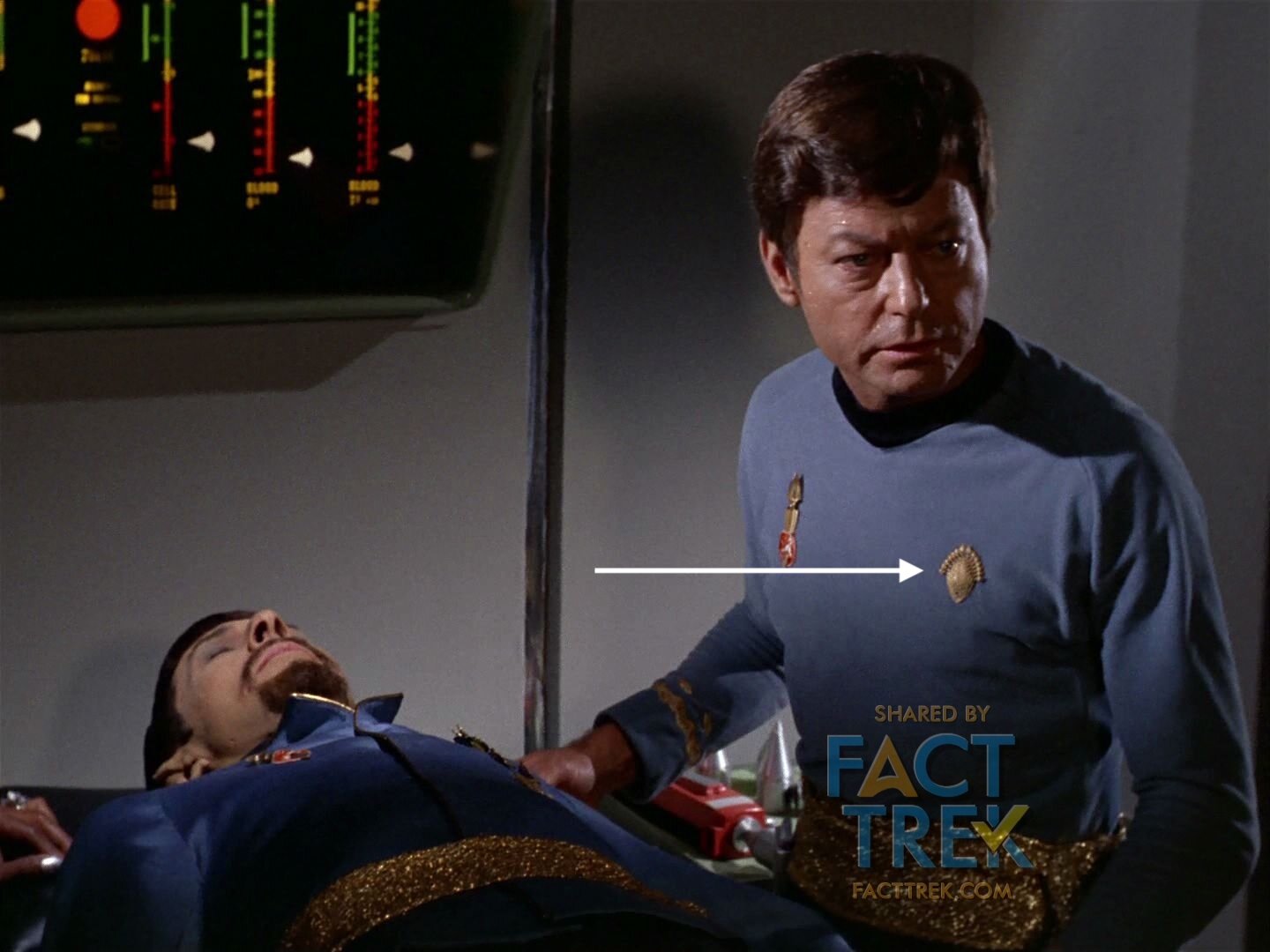
Speaking of Gary Mitchell, both his & Doc Piper’s sickbay duds feature a another emblem: a variation on a caduceus—the medical symbol featuring a snake or two snakes around a staff—featuring two snakes entwined about an elongated arrowhead shape (now doesn’t that look familiar?) set in the middle of a laurel wreath.


The same symbol appears on the sickbay duds worn by Khan in “Space Seed” (probably the same costume) and perhaps elsewhere, but we haven’t scoured every sickbay scene to check.
The laurels on both it and the United Earth logo prefigure the United Federation of Planets seals in Franz Joseph’s 70s works and subsequent Star Trek productions.
Both the “United Earth” and caduceus emblems are clearly inspired by the UN Logo, first proposed in 1945 and a revised version approved in 1946. While these obvious swipes would not make the transition to series production, they would eventually re-enter the Star Trek universe by way of the United Federation of Planets logo. The first variation of this appeared on the 1975 book the Star Fleet Technical Manual, with the silhouettes of male and female profiles in place of the laurels and stars in place of the Earth continents. In 1979 The Motion Picture followed that lead but reinstated the laurel wreath, variations of which appeared in subsequent films in the series. Yet another variation appeared (we think) on a screen in Star Trek: The Next Generation’s early 1988 episode “Datalore”. Other riffs on it have appeared numerous times since.
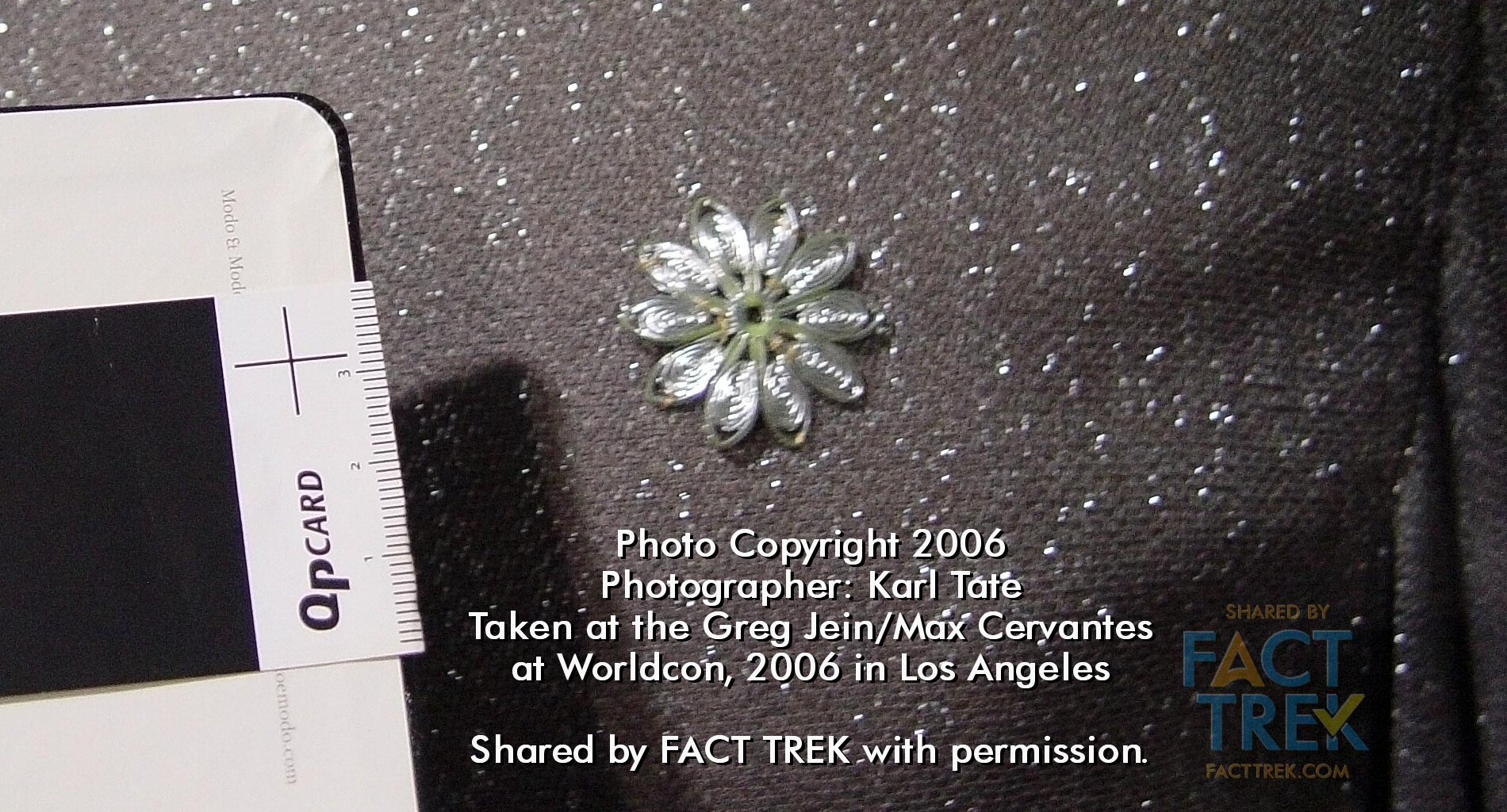
Sunflower Power
This device is worn only by Starbase personnel and on all flag officers but one (Commodore Decker).
At a glance this golden emblem looks perhaps like a sunburst, but on closer inspection it’s a (still) commercially available stylized filigree or filigree-look flower. So we’ll just call it the Starfleet “Sunflower” to keep things clear.


This Sunflower symbol is never seen aboard ship except for visitors (Lt. Areel Shaw, Commodores Stone, Wesley, Stocker and illusory Mendez) or when a silver haired flag officer appears on a Skype Zoom call to tell Kirk “nope” (Commodore Barstow, Admirals Fitzpatrick, Komack & Westervliet).
This stock filigree flower design might look familiar to anyone whose been to Disneyland, as giant ones appear on the It’s A Small World ride building.
![[4]](https://images.squarespace-cdn.com/content/v1/5d8938941257b15f27f817c2/1632947810534-1WDJZPZ7MW3KW90A6RDS/It%27s+a+Small+World+Loren+Javier+WM.jpg)
![[5]](https://images.squarespace-cdn.com/content/v1/5d8938941257b15f27f817c2/1632947810425-8RPCO6MVP8RS9SKUYMH1/It%27s+a+Small+World+by+Ryan+WM.jpg)
🎶 It’s a Star Fleet after all. It’s a Star Fleet after all.
It’s a Star Fleet after all. It’s a Star Star Fleet. 🎶
A slight variation on the Sunflower, smaller and in a silvery or pewter color, appears on the sparkly Cadet’s Uniform shirt (as specified in the script) of simulated cadet Finnegan in “Shore Leave” and then on guys seen in the background where Starfleet types hang out: i.e. the lounge where Scotty wallops Korax the Klingon in “The Trouble With Tribbles” and the lounge from whence Scotty is accused of being Jack the Ripper in “Wolf In the Fold”.


All but one starbase personnel seen wear the Sunflower—that one exception (that we know of) is in “The Menagerie” Part I, where Commodore Mendez has a briefly glimpsed aide or secretary who wears the same insignia as the Enterprise crew. Likely a production oversight given she’s barely glimpsed.
That’s no Starbase insignia!
Outpost
We’d be remiss not to mention the Outpost insignia briefly seen on the uniforms of Lieutenant Harold in “Arena” and Commander Hansen “Balance of Terror” (serving on an Earth/Federation Outposts appear not to be choice assignments if the fate of these poor schlemozzles is anything to go on). Nothing tells us these personnel are Starfleet per se, so we’re not going to assume anything.
The found object used to make the Outpost insignia was also employed on the mirror universe uniforms of Spock and Bones in ”Mirror Mirror”, there a different color (gold not white), rotated 90º and without the black backing.


Thanks to Karl Tate we have closeup photos of the Outpost insignia and the “Mirror, Mirror” decoration which demonstrates they were made from some sort of appliqué trimmed in different ways.[6]
The Boomerang
The very first Starfleet symbol to appear on screen was the Boomerang, even if audiences didn’t notice it. As it appears at the front of all the red pennants on the starship Enterprise it’s therefore in the very first shot of the series aired: “The Man Trap.” (It’s also in the first shot “The Cage” as screened for NBC in winter 1965.) It’s a simple rounded yellow shape, easy to miss on the Enterprise, especially on 1960s TV sets. But if anyone missed it there it appears plain as day on the pennants on the hull of the shuttlecraft in “The Galileo Seven”. Afterwards a metallic version of the same shape appears frequently as a piece of set decoration—most commonly behind flag officers whenever they get Kirk on a Zoom call.


But that shape was no Star Trek invention as rounded boomerangs, kidney and bean shapes were well-established space-age design elements by the time Matt Jefferies first employed the former on the Enterprise pennants in late 1964. Heck, such shapes appeared all over The Jetsons (1962–63) over two years before the Enterprise was designed.

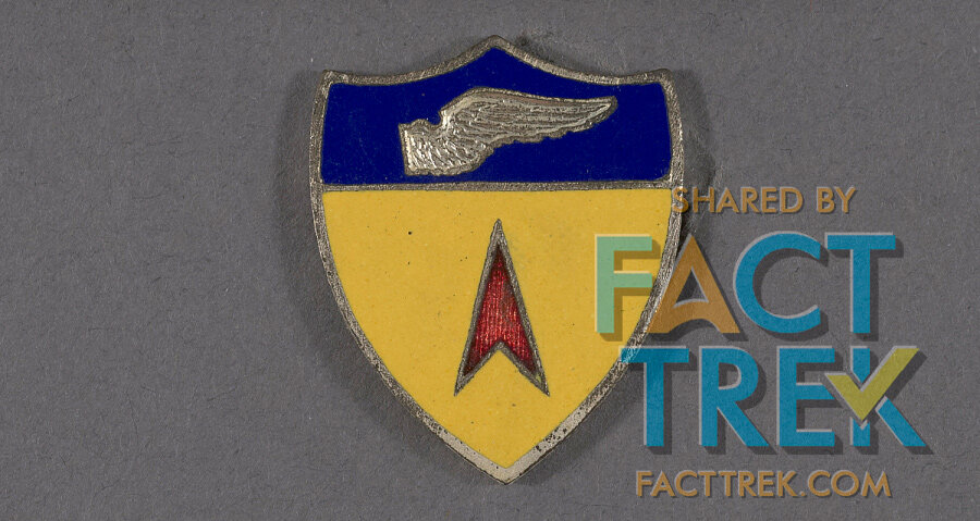
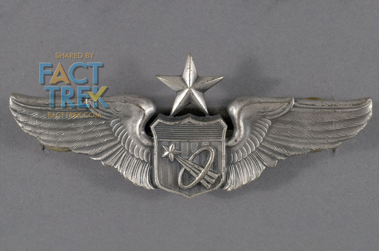
But that Starfleet Boomerang is likely based on common symbols—often called “darts”—of military air groups, as seen on the Western Transport Air Force shield, adopted c1958 (and used through its re-designation as the 22nd Air Force in 1966 and beyond). Such symbols would likely be familiar to former Army Air Corps man and aviation enthusiast Jefferies.


Some fans of British sci-fi might note that 22nd Air Force shield looks a lot like the emblem of the totalitarian “Terran Federation” from the BBC series Blake’s 7, which was likely inspired by those aerospace emblems. The B7 symbol also resembles an on-its-side version of the Starfleet insignia introduced in Star Trek—The Motion Picture. But before you cry “rip’off!” it’s worth noting that Blake’s 7 began filming in 1977 and debuted January 1978, thus its emblem was on film and on the air many months before The Motion Picture was announced in March 1978. TMP was the Trek project to first slap a circle behind the arrowhead, but Blake’s 7 got there first.
Which Came First? Dart or Delta?
Before diving into the history of what became Trek’s literal Registered visual mark (®), let’s clarify which came first—the Boomerang or the arrowhead. Star Trek art staffer and all around mensch Michael Okuda wrote to us about his conversations with both Thiess and Jefferies on the subject of emblems.
I asked Theiss if he had designed the arrowhead. He said ‘yes'. I didn't ask Jefferies the same question, but he never seemed particularly interested in the symbol. I note that it was never used on the sets, which might be interpreted to suggest that it wasn't his.[7]
So, while not a first-hand account from 1964, it agrees with the few documents we have seen related to the two emblems, and, as Mike notes, Jefferies designed the original series sets and the only Starfleet emblem which ever appears on them is the Boomerang.
We do know that the badge design was shaping up in mid-November 1964 when Cindy Robbins screen tested (see below),[8] whereas our earliest known glimpse of the Boomerang is when the 33” Enterprise model was presented to Gene Roddenberry and Jeffrey Hunter at the “Arab Village” set on the Desilu 40 Acres backlot, or on about December 14, 1964.[9]
But which came first? We’ve to date found no conclusive evidence either way.
The “Flying A”
Star Trek’s most distinctive emblem—and its registered visual Trademark—is the A-shaped Starfleet device first seen worn by the Enterprise crew. As above, Okuda told us that costumer Bill Theiss claimed credit for it. Theiss called it simply the “arrowhead”, but over the years others have called it a “delta” or just “badge” (and, from TNG forward, a “combadge” when the shape is used as a communicator).
But since it has no official designation, and the terms “arrowhead” and “delta” are adjectives we touch on repeatedly in this piece, for clarity we’ll to take our cue from an April 24th, 1967 memo from Gene Roddenberry wherein he referred to the emblem as “the Flying A.”
Roddenberry called it the “Flying A” ergo so do we.[10]
So why did Roddenberry use the term "Flying A"? Well, one likely origin for the term is the iconography of Flying A service stations,[11] which would have been long-familiar in the U.S. in the 1960s.

Perhaps Starbase 11 could have borne this logo…
Like its closely related cousin, the “dart,” the Flying A is a variation on a common aerospace symbol, often called a “delta” (for the Greek letter Δ), and oft employed to indicate a directional vector. An arrowhead version of such a symbol appeared in U.S. Army Air Force emblems as far back as 1935: 29 years before the Flying A was conceived. But a delta as an aeronautical symbol goes back even further, as seen in Delta Airlines logos from the 1920s and 30s. It even starts looking like an Air Force delta/dart by 1959.

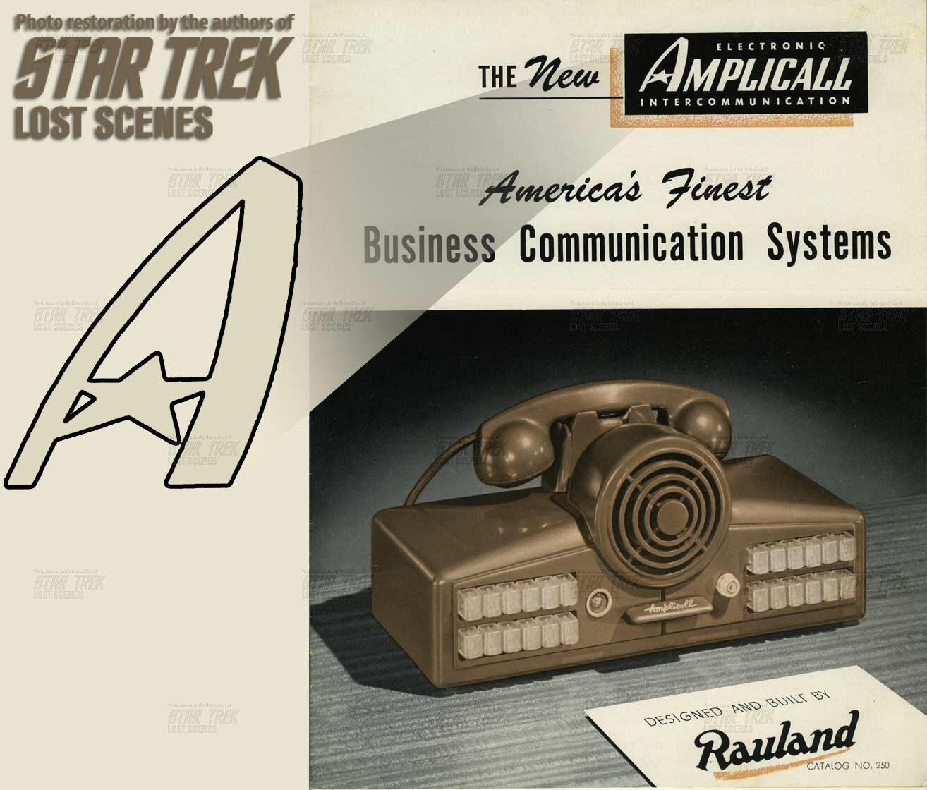
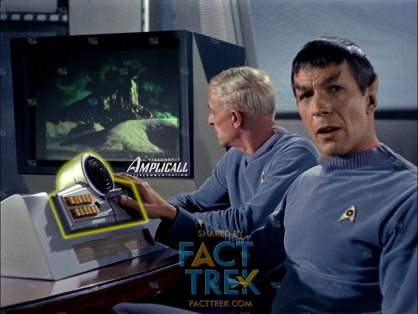
Interestingly, and probably coincidentally, the console seen in the first pilot briefing room, identified as an Amplicall Business Communication System by our Star Trek Lost Scenes pals,[12] featured a very familiar looking stylized “A” in its name/logo. (It’s unlikely Theiss saw this, but, again, not impossible.)
Whatever its inspiration, the earliest record we have for the Flying A design is an undated sketch of the first pilot landing jackets by Theiss.[13] Note that the emblem has a curved, not pointed, top, which matches the emblem worn in the Cindy Robbins screen test with Leonard Nimoy (see this article for more about that test), which documentary evidence indicates to have been filmed around November 18th, 1964. Theiss himself said he was hired for Star Trek on the basis of Roddenberry seeing costumes he’d done for the play The World of Ray Bradbury, which opened at the Coronet Theatre on October 14, 1964, and there are memos for Nimoy makeup tests as early as October 30th, so this suggests the emblem in the sketch and in the screen test photos was designed between late October and mid-November, 1964.[14]


So, just why is the Flying A asymmetrical, with a thicker stem to the left? It could just be a stylistic choice, or it too could be inspired by some of those air group deltas. For instance, the shield of the 163d Reconnaissance Wing (discussed earlier) renders two such deltas in perspective. Rotate one of those to point up and it looks pretty familiar, doesn’t it?
Closer to Star Trek’s airing we find the NASA 1959 “meatball” device, with its red chevron symbolizing an airfoil/wing representing aeronautics, which also evokes “darts”. (Check out the meatball’s history at this link). There’s also NASA’s astronaut device, which first appeared on aviation badges of the U.S. Navy and U.S. Air Force. A 1964 article in Space News Roundup, the newspaper of NASA's Manned Spacecraft Center, read:
NASA's twenty-nine astronauts are wearing a new emblem, unofficially signifying the unity of the Mercury-Gemini-Apollo flight teams.
The design shows a trio of trajectories merging in infinite space, capped by a bright shining star and encircled by an elliptical wreath denoting orbital flight." [15]
Remember that ellipse for later. The meatball was in use years before Roddenberry wrote his Star Trek pitch, and the astronaut pin was announced around the time NBC agreed to order the first Star Trek pilot.


But don’t just take our word for it. See Jill Burrows’ detailed article about the origins of the U.S. Space Force emblem and its many antecedents (link).[16] The influence of these on the Starfleet starship emblem is indisputable. Trek borrowed...didn’t invent.
Delta Darts: Evolution of The Flying A
As the longest-lasting Star Trek emblem, The Flying A has seen numerous iterations. Let’s briefly go through them.
In the first pilot the backing was a woven metallic fabric with a gold border. In the second pilot the border was black. Series insignia were larger and made with a more reflective gold backing material. All featured a symbol relating to a department or division. The three main ones, an elongated star, two overlapped ovals, and a spiral, were present from first pilot through the series. The use of the ovals and spiral were swapped for the second pilot, but swapped back for series production.


There were two additional division emblems.
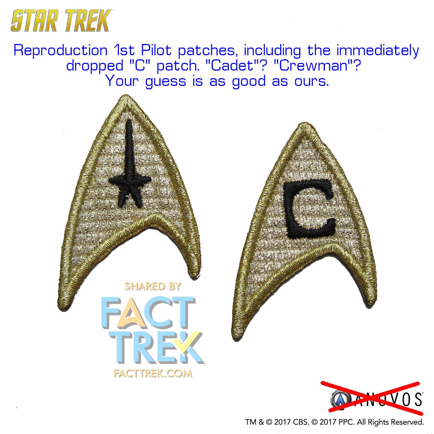
One—looking rather like a letter C—appeared only in the first pilot and then vanished. An early version of it appears on the Theiss jacket sketch above. We’ve encountered no primary source documentation to confirm what it meant but it’s only seen on the blue shirts of two nonspeaking young men on the Enterprise bridge, neither of whom sports any braid on their uniform cuffs.
The other was a red cross for Nurse Chapel, hastily added atop a regular sciences badge’s ovals. Later red crosses were added to blank badges for Chapel and other nurses (e.g. “Obsession” and “The Immunity Syndrome”) but only ever appeared on female nurses and never on doctors McCoy and Dr. M’Benga.
Whose Badge Is It, Anyway?
The Flying A’s status as a service symbol got confusing for fans beginning very early on when, in the series’ second aired episode. “Charlie X”, the Captain and First Officer of the spaceship Antares both wear patches of the same material as those worn by the Enterprise crew, but of a completely different design. The Antares was clearly not a “Starship” in league with the Enterprise (exactly what the Antares was is unclear, because in the episode it is confusingly referred to first as the “cargo vessel Antares” then as a “transport ship,” then as a “science probe vessel” and finally as a “survey ship with twenty men aboard”), so it was possible and logical to assume the different emblems were because the ships were not of the same branch of service or the same fleet. (One of the Antares shirts and emblem appear on a background player in the bar fight scene in “The Trouble With Tribbles”.)
When the two part “The Menagerie” first aired two and half months later, a Flying A insignia appeared not only on the Enterprise crew uniforms, but also on a non-Enterprise “space officer” seen in footage from the first pilot “The Cage”. In Pike’s Orion illusion, this script-described “uniformed Space Officer (not from the Enterprise)”[17] wears a pullover sporting a Flying A with a star; a detail presumably plucked from Pike’s memories. So the idea that the Flying A wasn’t an Enterprise-specific emblem was there right from the start.

And this idea was reinforced two months later in “Court Martial” when Captain Kirk addresses men in the Starbase 11 bar whom are clearly seen wearing Flying A’s:
        KIRK
Timothy, I haven't seen you since the Vulcanian expedition.
    (no reply)
Well, I see our graduating class from the Academy is well represented.  Corrigan. Teller. How you doing, Mike?
This dialog indicates these men are not from the Enterprise, as they’d certainly not get as lippy as they are with Kirk had they been in his chain of command. Earlier dialog establishes that the Enterprise repairs are being prioritized over the Intrepid, so there’s at least one other ship in orbit—maybe as many as nine, based on the 10-entry “Star Ship Status” chart seen in the episode, so presumably these men are from one or more of them. That too strongly suggests the Flying A is not Enterprise-specific.
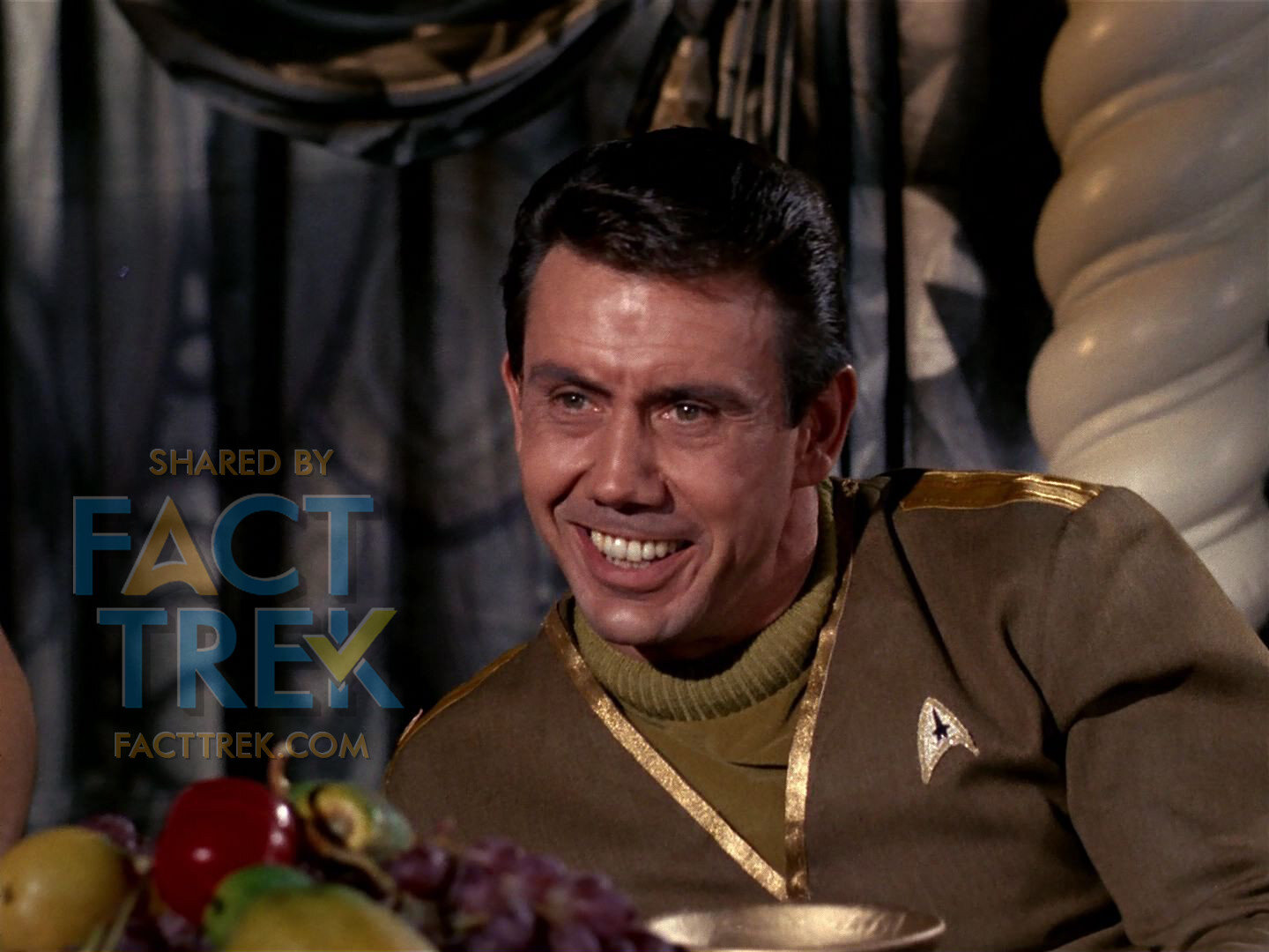
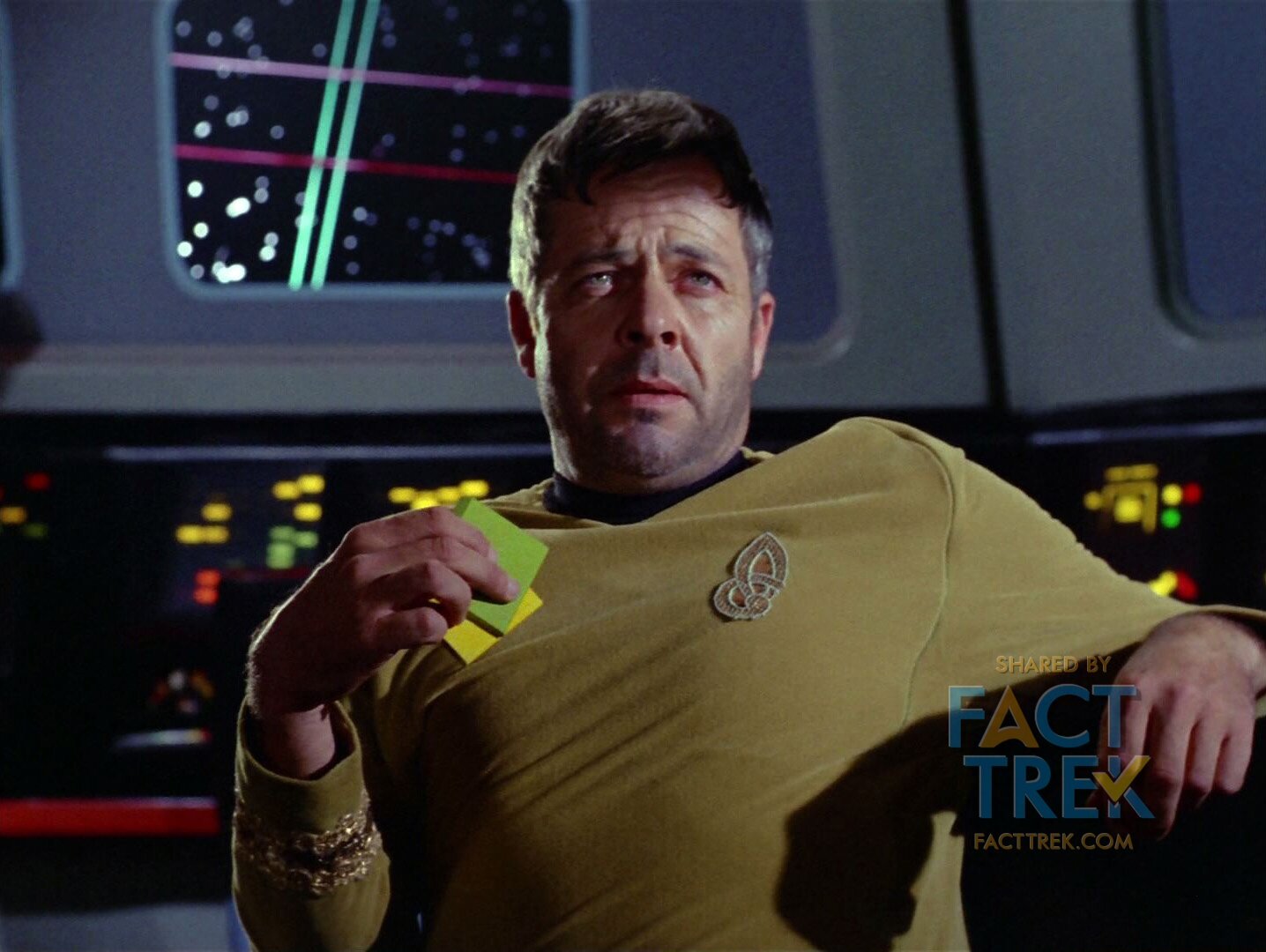
But that—pardon the pun—uniformity got undermined twice in the following season when in “The Doomsday Machine” Commodore Decker of the wrecked starship U.S.S. Constellation (clearly a sister ship of the Enterprise) was seen wearing an entirely different emblem. This was compounded four months later when Captain Ronald Tracey and his CMO (Chief Medical Officer) of the starship U.S.S. Exeter appeared, both wearing a rectangular insignia which differed from those worn by the Enterprise crew.

This led many fans to assume that each ship in the fleet had its own, unique insignia. They imagined adventures for other ships in the fleet and began devising all sorts of badges for these never-seen crews. So common is the notion that each starship had a unique insignia that it was addressed in licensed Star Trek books, notably Mr. Scott’s Guide to the Enterprise (1987)[18] and subsequently in Rick Sternbach Michael Okuda’s book The Star Trek: The Next Generation Technical Manual (1991). Both offered effectively the same explanation why the insignia got standardized, beginning in Star Trek—The Motion Picture (1979).
![[19]](https://images.squarespace-cdn.com/content/v1/5d8938941257b15f27f817c2/1633397155844-XWI6CYUH28FFHAODZZWJ/TNG+Technical+Manual+Page+4+-+Enterprise+Emblem+WM.JPG)
But in fact, these assumptions were a mistake caused by a simple production error, as called out in a typically jokey Bob Justman missive regarding “The Omega Glory” (which began filming on December 15, 1967).[20]
As per Justman’s memo, the Antares was not a “Starship” in the same sense the Enterprise was, hence the crew’s different insignia.
So why did Justman call out Captain Tracey and not the earlier Decker? There’s no clear answer, but possibly because Decker is a commodore, and no officer of higher rank than captain seen in the series ever wears the Flying A. As we never saw another member of the Constellation crew, there’s zero evidence they wore anything like what Decker did. In fact, like the Starfleet Sunflower, Decker’s emblem doesn’t feature the departmental symbols seen on all the Flying A’s and the Exeter badges, which is another strike against it being a ship’s emblem.


Did Theiss heed Justman’s screed? Well, in season three’s “The Tholian Web”, the deceased crew of the starship Defiant wear the Flying A. Some fans have speculated that the emblem was deliberately obscured by director Ralph Senensky, but they are perfectly clear in several shots (albeit possibly difficult to see on a 1960s TV). Roddenberry’s dictum that all starship personnel bear the same symbol as the Enterprise crew wear was clearly in force.
Flying A’s abound on the U.S.S. Defiant.
Of starship crew seen, only Tracey and his Chief Medical Officer of the Exeter break the Roddenberry edict.
That’s it for Starfleet-related insignia see on the original Star Trek. As we’ve demonstrated there’s really only a single mistake regarding the Flying A (the Exeter crew). But Star Trek didn't end with its 1969 cancellation. What about sequels & spin-offs?
Filmation Flying A
The Flying A reappeared in simplified form in Star Trek Animated (what some call Star Trek the Animated Series); less curved and looking even more like the aerospace deltas that clearly inspired it. These also preserved the various departmental insignia centered on each badge...the last to do so for 25 years, but dropped the medical cross from Chapel’s badge in favor of the sciences ovals.


The show was a bit inconsistent re Justman’s dictum. The first time we see non-Enterprise Starfleet ship personnel, in the episode “The Eye of the Beholder”, they sport Flying A’s, but the episode is vague about their ship—the Ariel—which is described as both a “survey ship” and “science ship” that had a crew of six; not enough for a “Starship” crew. And while the two crew whose badges we see both sport the sciences division symbol, they wear different color uniforms, whereas science division usually goes on a blue shirt/skirt.
The next time we see Starfleet personnel in “The Pirates of Orion” they are members of the crew of the freighter SS Huron, and none wear the Flying A. As a freighter the Huron could be in a similar “merchant marine” category as Justman had described the Antares of “Charlie X,” but he might’ve forgotten that ship was described as four different things, including both a “transport” and a “science probe vessel”. So it’s all a bit muddy.
In “The Time Trap” a woman appears wearing what looks a lot like first and second pilot women’s Starfleet shirt in white, featuring an oddball blue badge, but as we have no idea who she, is and where/when she’s from of it’s impossible to say anything factual on the subject.
Flying A’s On the Silver Screen
Star Trek—The Motion Picture changed up the Flying A, driving back towards its aerospace roots (by design or by accident) by setting the arrowhead against a circle—suggesting the “orbit” ellipse on astronaut pins. Another change was reducing the different departmental symbols to just one: the elongated star.
This revised emblem appeared both as a pin on dress uniforms like the one worn by Admiral Kirk at the top of the film, and as patches seen on the left breast of most of the crew’s uniforms and on the sleeves of the engineering suits.
Security guards wearing their armor display no visible insignia (one might assume a badge is on the shirt under the vest) other than a simplified Flying A shape in cream color with no star and no backing circle on their helmets.


Other variations of this device appear throughout the film, though often in blink-and-you-miss-it circumstances. The Flying A with no star on a circle is embossed or printed on various props. It also replaced the Boomerang on the starship’s pennants, but tipped to point forward, just like the Boomerang (minus the star symbol). The Boomerang had been cast away, but Boomerangs come back...albeit not for 26 years.
Thus the notion of ship-specific insignia was put to bed in The Motion Picture, where—other than Epsilon 9’s badges and Bones’ caduceus—all Starfleet personnel seen, even deskbound Admiral Kirk, wear the Flying A on their collective breast...a tradition which persists 40 years later.
Whilst The Motion Picture uniform patches replaced the three division symbols with just the star at the center of the Flying A, department / division was still indicated by the fill color of the circle around the patches (and epaulettes), but going from three divisions to six. Those colors on the Flying A emblem circles and epaulettes were as follows:
White = Command (Kirk, Decker)Orange = Sciences (Spock)Green = Medical (McCoy, Chapel)Red Engineering = (Scotty, Cleary)Gold = Operations (Ilia, Uhura, Sulu)Grey = Security (Chekov)
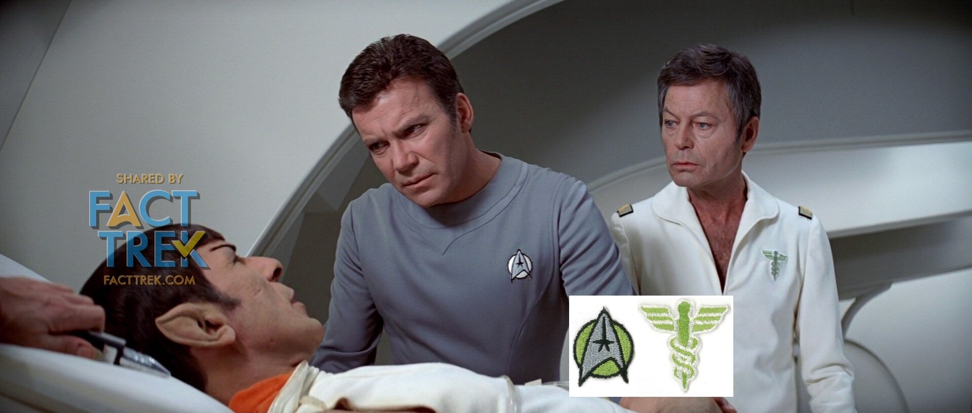
Detouring from the Flying A for a moment, let’s talk about the two other uniform emblems we see clearly. Bones has a green caduceus, sadly seen only in this film (it was replaced with an ugly pin for The Wrath of Khan).


Another seen-only-once emblem appears on the crew uniforms of comm station Epsilon Nine. While these people aren’t specifically called out in the film as Starfleet, they are routing communications between Starfleet ships. Anyway, their “stinking badges”—which appear to represent communications antenna dishes with signals—feature almost the identical background colors as on the Starfleet ones (except that black replaces grey). Signage designed of that emblem printed in the Star Trek—The Motion Picture Peel Off Graphics Book gives it more detail.
From The Motion Picture onwards the Flying A became the de facto Starfleet emblem. Star Trek II: The Wrath of Khan repurposed TMP’s Admiral Kirk Class A insignia pin as the standard device, just in a dark brass instead of gold; and on officers it was laid over a bar device. The TMP patches remained on the engineering suit sleeves, but vanished otherwise. Thus the division colors were eliminated from the badges but indicated on other parts of the uniforms (turtleneck shirt, epaulettes, shoulder straps, and armbands) and slightly changed.


Another variation of the metallic Flying A appears on devices on the field jackets worn by Kirk’s landing party. A similar but larger Flying A on a circle became the belt buckle with a broken one hung as a pendant hanging from Khan’s necklace.
The remainder of the feature films featuring the original series characters stuck with these pins and buckles for Starfleet personnel.
Back to TV
In 1987 Star Trek: The Next Generation stepped back to the basic design of The Motion Picture Flying A sans departmental symbols as seen on the refit Enterprise’s pennants, but altered the circle to a more NASA-like ellipse, and made a pin/device of it with a silver arrowhead on a gold ellipse. This handsome design only lasted for the duration of The Next Generation’s run and Deep Space Nine’s first two seasons.


A slight variation on this design appeared for Wesley Crusher’s “acting-ensign” combadge during Next Gen’s 2nd & 3rd seasons, with the entire badge being rendered entirely in silver; no gold.
That same new-to-Next Gen version of the emblem also appeared on the pennants seen on Starfleet vessels, as seen atop the nacelles of the NCC-1701-D. There the ellipse was red.
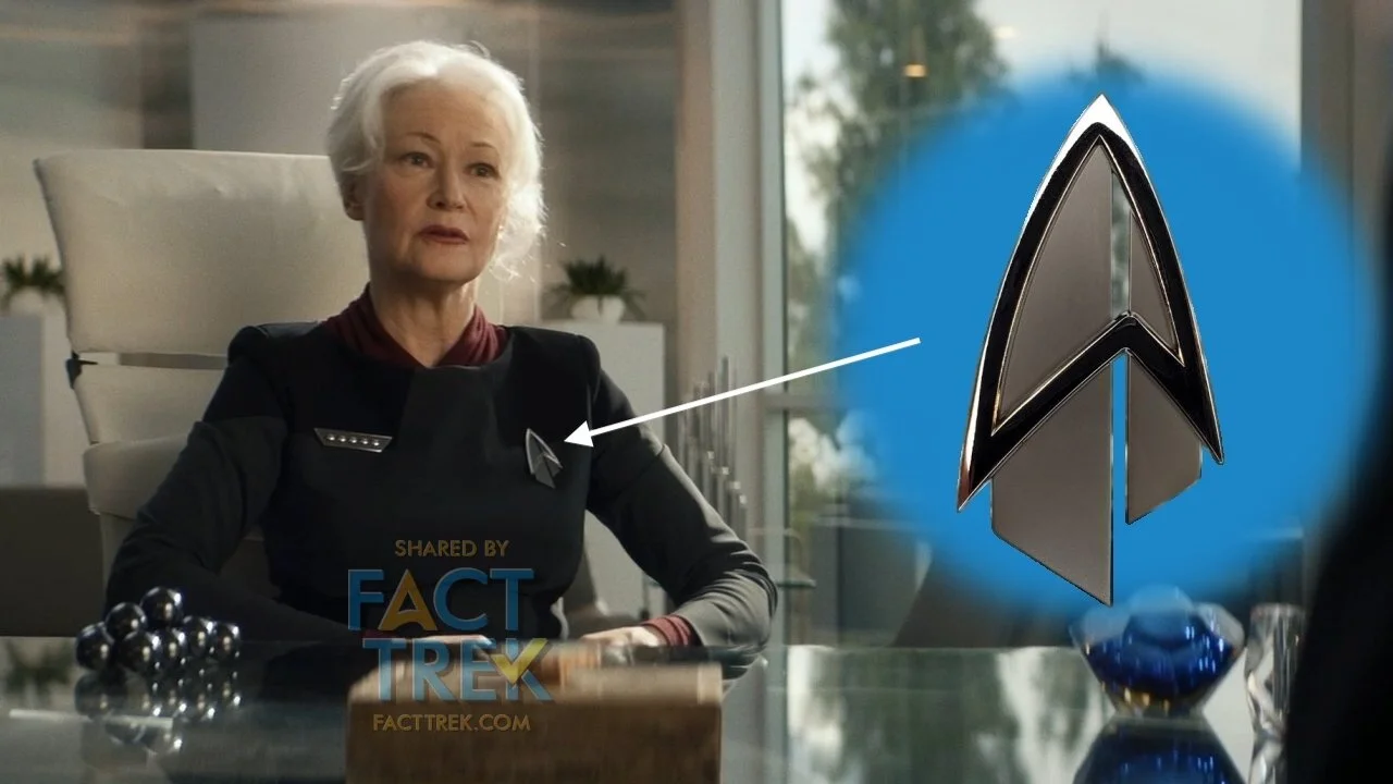
New Flying A combadges were designed for the film Star Trek: Generations, and adopted for Deep Space Nine’s third season, thus appearing there first. The backing shape was squared off on the sides and made partly hollow. This design carried through Voyager and appears in flashbacks on the show Picard.

(Star Trek) Enterprise is known for breaking with tradition and giving early Starfleet no Flying A’s whatsoever… or did they? See those tiny patches on the “enlisted” uniforms? There’s a U.S. Space Force-esque delta and one to three stripes designating Crewman, Crewman 2nd Class and Crewman 1st Class.


The Boomrang Boomerangs Back
After being MIA for 26 years—from 1975 when Star Trek Animated ended until 2001 when Enterprise premiered—a Boomerang Starfleet symbol returned for (Star Trek) Enterprise, where it became almost a hybrid of the Boomerang and the Flying A.
Interestingly, When Enterprise did a call-forward episode to the original series segment “The Tholian Web,” in “In A Mirror Darkly—Part 2,” they stuck with the “separate insignia for each starship” idea for the Defiant uniforms despite “The Tholian Web” on-screen evidence to the contrary. But they did make the new Defiant badge effectively a Boomerang, tying it back to those on the original series and their own Boomerang-Flying A.

Enterprise was Defiant concerning Justman’s edict that all Starship crews wear the Flying A…or more likely they just didn’t know about it.
Back to Basics
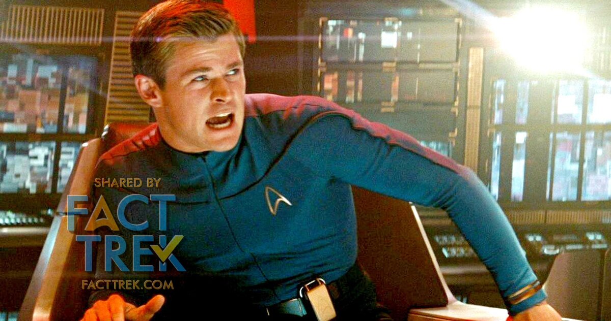
With the “Kelvin” timeline films beginning in 2009 the Flying A went back to the aircraft delta basics and stripped off any backing shapes.
The crew of the Kelvin wear simple outlined versions of the shape.
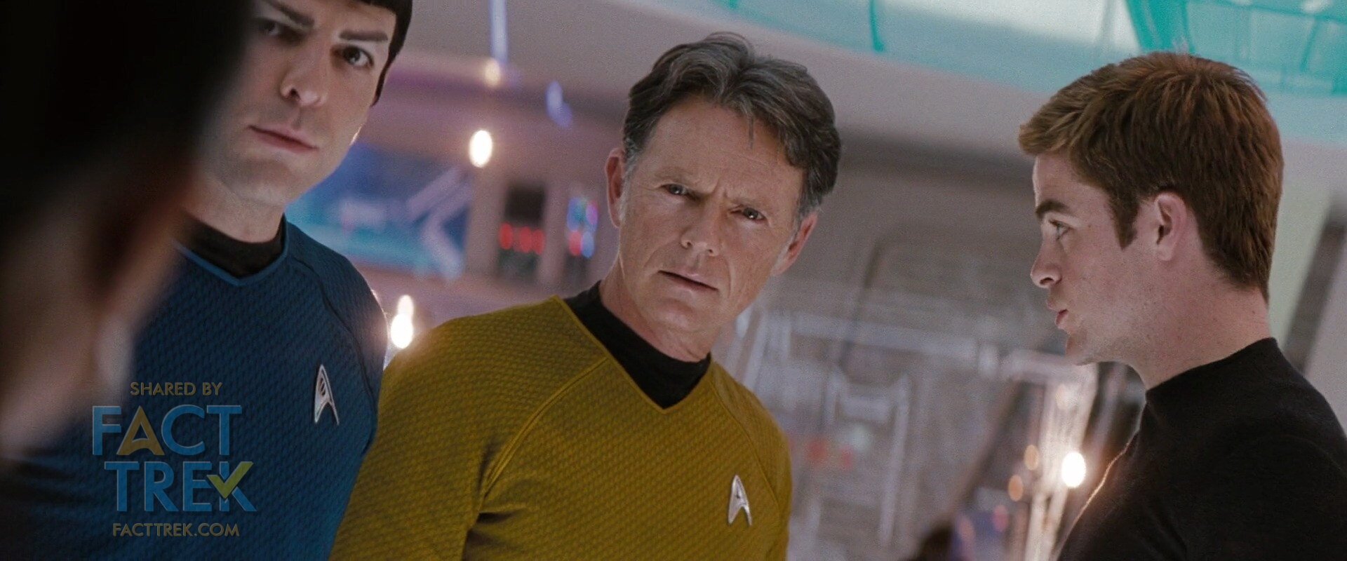
Many many variations are worn by the cadets, Kelvin crew and Starfleet personnel, including the Enterprise crew, ranging from simple silhouettes printed on shirts, gold collar pins and shirt badges, etc., but those on the starship—notably those worn on the original series-esque duty uniforms—restored the all three main departmental symbols not seen since Star Trek Animated.
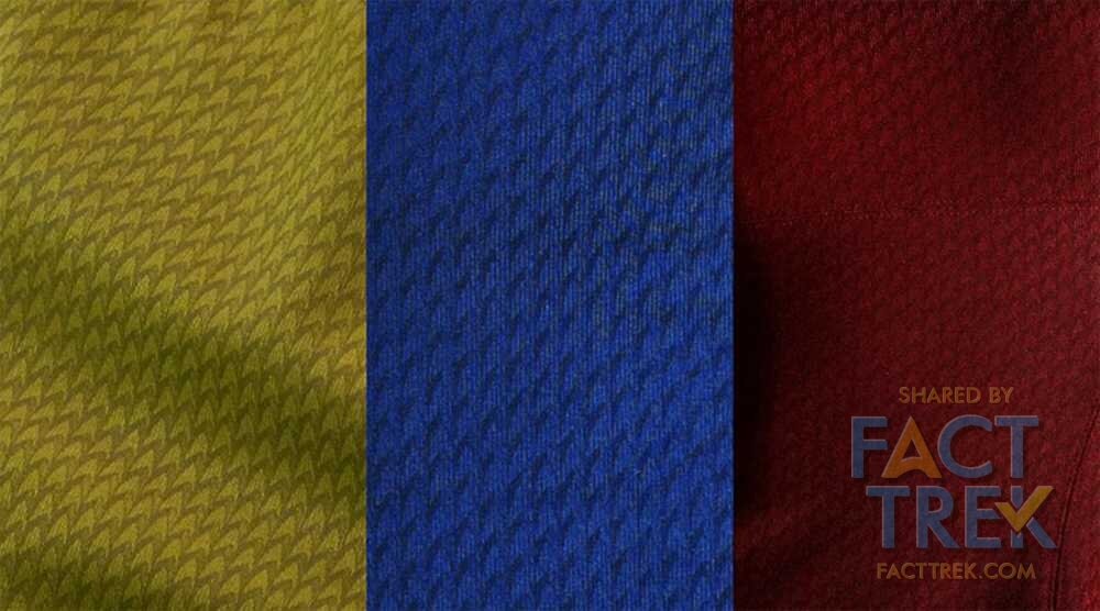
And Flying A’s abound in both Star Trek (2009) and Star Trek Into Darkness where the starship duty uniform tunics have a pattern of tiny little deltas all through them. This patterning vanished with Star Trek Beyond, but the Flying A badges there are at best slight variations of those seen in the previous Kelvin timeline films.
The medical cross division symbols made a return in Into Darkness, now finally seen on McCoy.

The Flying A’s worn by the crew of the U.S.S. Franklin in Star Trek Beyond were simple brushed metal deltas with no details. The one shoulder patch we see clearly (Spock wearing a Franklin jacket with red/support division shoulder patches) features a small four-pointed star. What this signifies is unclear.
U.S.S. Franklin Flying A badge and patch
Streaming Symbols
Star Trek Discovery changed the badges up, again, sectioning off the right quarter of the emblem, keeping the main three departmental symbols, plus a cross for medical, and placing the rank “pips” directly on the emblem’s lower left (making them rather difficult to see). Variations included:
Admirals wore this Flying A on a laurel-wreathed disk, sans pips
Cadets wore this Flying A on a toaster oven grill with a black backing and zip pips
Section 31 wore this Flying A but pipless, division symbol-free, in black and silver
Prisoners wore a featureless dark gray Flying A
When the show brought Captain Pike and his Enterprise crew into the mix, they reverted to smaller metal badges much more in line with the original first pilot, albeit in silver instead of gold, coming almost full circle to those first emblems in 1964. As of this writing it appears these will be used in the upcoming Strange New Worlds.
When Discovery was thrown into the 32nd century in season three the far future Starfleet they encountered bore badges with a Flying A within an encompassing ellipse with the rank pips moved to the upper right edge. Frankly it’s a terrible design that looks like not much of anything except in close angles.


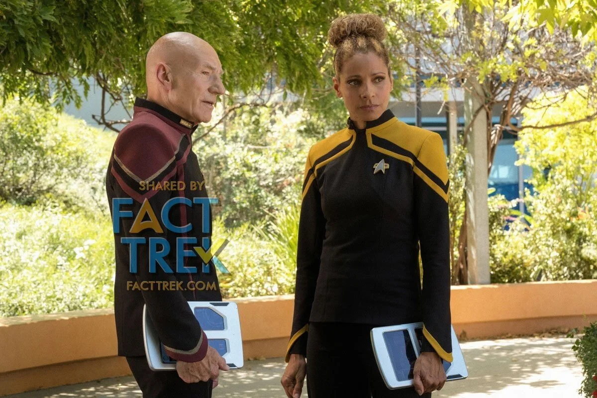
2020 brought two new Star Trek shows and with it two new variations to the The Flying A. Those worn by Starfleet personnel in Picard harken back to a design employed in an alternate future seen in “All Good Things,” the final episode of The Next Generation: an outlined delta with a pair of angled shapes at the back. Signifying…? Your guess is as good as ours.
On Star Trek Lower Decks the Flying A’s are super simplified shapes with very subtle curves and no departmental symbols. They look just about like those NX-01 Enterprise Crewman deltas...or the U.S. Space Force’s. We’ve come full circle…or is that orbit?

Finally, in 2021 there’s the 3D animated Star Trek Prodigy, the trailers for which at first depicted a holographic Janeway wearing her old Voyager era combadge, but a more recent video clip reveals her wearing a simpler Flying A with no backing shape which appears to be split by the left half of a command division star. Whether any other characters take to wearing a Flying A, combadge or otherwise, remains to be seen.

One more for the road.
So that’s the story so far. Arrowhead, Delta, Flying A . . . whatever you call it, it’s been around for almost 56 years and shows no sign of going anywhere...except maybe straight up.
— 30 —
Revision History
2021-10-06 Original post.
2021-10-10 Section Filmation Flying A updated to include crew from the Star Trek Animated episode “The Eye of the Beholder” we had previously missed.
2021-10-11 Added the Flying A Service logo image and mentioned it in the text. Revised the text about holographic Janeway’s combadge and added a new as-of-this-date image.
2021-10-13 Added the U.S.S. Franklin insignia from Star Trek Beyond and two additional badges from Discovery.
2002-04-14 Added information that the medical caduceus appeared on Khan’s sickbay duds as well as being seen in the second pilot.
Acknowledgments
GREAT THANKS to our friends David Tilotta & Curt McAloney for providing us with the image of the Amplicall Business Communication System and its Starship emblem-esque logotype’s “A’. Check out their amazing book STAR TREK LOST SCENES and then buy it! (link).
SPECIAL THANKS to Michael Okuda for his input as regards who invented the chicken or the egg…we mean, the Boomerang or the Flying A. Follow him on Twitter (link).
FACT TREK Associate Ryan Thomas Riddle for his invaluable input and edits. Follow his adventures through time and space on Twitter (link) and see his work on his homepage (link).
Mark Farinas for reviewing the piece and finding boo-boos. Read his Star Trek The Webcomic (link), an entry for which features a cap just like Captain Pike’s but with that “Merchant Marine” Antares emblem (link to specific strip).
Gratitude to Karl Tate who allowed us to share his photos of various badges and insignia. Visit his Flickr feed (link).
CorporalCaptain, J.T.B. and Daddy Todd on the TrekBBS for pointing out items we’d missed in the original post.
And, as ever, Trekcore.com for their vast library of screenshots used to illustrate this article.
Notes & Sources
[1] August 10, 1964 memo from Gene Roddenberry to Pato Guzman, Subject: Star Trek Emblem. UCLA, Gene Roddenberry Star Trek television series collection, 1966–1969.
[2] Photo of "United Earth" emblem on lab coat. Photo © Karl Tate, used with permission. (link)
[3] UCLA, Gene Roddenberry Star Trek television series collection, 1966–1969.
[4] The It's A Small World ride at Disneyland. Photo by Loren Javier/Flickr Creative Commons. Reproduced here with added attribution. (link)
[5] The It's A Small World ride at Disneyland. Photo by Fact Trek Associate Ryan Thomas Riddle. Used with permission. (link)
[6] Photos of "Outpost" badge, and example of the source found item which was trimmed and rotated different ways to represent it as well as decorations worn by mirror universe Spock and Bones. Photo © Karl Tate, used with permission. (link)
[7] Private correspondence with Michael Okuda, 2020.
[8] Nov. 18, 1968 unexecuted contract for “Cindy Robins” [sic] aka Cynthia Chenault. The word "tests" is handwritten on the cover letter. Perhaps this was pending the results of the tests? The contract is the same date at the contract offered to Laurel Goodwin. UCLA, Gene Roddenberry Star Trek television series collection, 1966–1969.
[9] “The Menaagerie” (aka “The Cage”) call sheets. UCLA, Gene Roddenberry Star Trek television series collection, 1966–1969.
[10] April 24, 1967 memo from Gene Roddenberry to Bill Theiss, Subject: Star Trek Ensignia [sic] UCLA, Gene Roddenberry Star Trek television series collection, 1966–1969.
[11] Associated Oil Company and Tidewater Petroleum a WIkipedia.
[12] Amplicall logo. Also reported in “Behind the Scenes of ‘The Cage’”, David Tilotta and Curt McAloney, StarTrek.com, 15 Aug 2016. (link) Images used with permission of the authors.
[13] Undated costume sketch for landing party field jackets and insignia, by William Ware Theiss. [Approximate date: Oct.–Nov. 1964.] UCLA, Gene Roddenberry Star Trek television series collection, 1966–1969.
[14] [Interview] Behind the Camera—William Ware Theiss by D. C. Fontana, Inside Star Trek [newsletter] No. 6, December, 1968, p.5.
[15] Astronaut's New Emblem Symbolizes Unity of Mercury-Gemini-Apollo Teams, NASA Space News Roundup, vol. 3, no. 15, May 13, 1964. (link)
[16] May 19, 2020, “Star Trek or US Space Force? Let us settle this debate once and for all,” by Jillian Ada Burrows, for Medium. (link)
[17] “The Menagerie” (aka “The Cage”) script Revised: Nov. 20, 1964, scene 85.
[18] Lora Johnson (as Shane Johnson), Mr. Scott’s Guide to the Enterprise, Pocket Books (July 1, 1987), p.24. ISBN-10: 067163576X; ISBN-13: 978-0671635763
[19] Rick Sternbach and Michael Okuda, Star Trek: The Next Generation Technical Manual, Pocket Books; 1st edition (November 1, 1991), p. 4. ISBN-10: 0671704273; ISBN-13: 978-0671704278
[20] December 18, 1967 memo from Bob Justman to Bill Theiss, Subject: Starship Emblems. UCLA, Gene Roddenberry Star Trek television series collection, 1966–1969.